Hey! It's Jerbear. Let's talk about how, even in 2022, email notifications are still a crucial way to communicate with users.

Problem
Sometimes, in a frenzy to develop new and exciting features, things like notification emails can fall by the wayside. That was exactly the case for an automated email report sent to users of TechSmith Quizzing. It had not been updated since When a user takes a video quiz, the system sends an email report to the owner of the quiz. That email system was working, but I saw three areas for improvement. Many email clients block images – so a user viewing the email may not even see the call to action. Text inside an image can also render poorly due to being scaled up or down, making the text appear blurry to the user. And finally, images are expensive to create and difficult to swap out, so translating to other languages becomes cumbersome. Viewing these emails on a phone or tablet resulted in horizontal scroll bars and the content failed to respond to the user’s screen size and orientation. The content was created for a desktop screen and did not consider the growing number of devices and screen sizes. Additionally, we had data showing that many users were primarily accessing these emails from their phones. These reports were only available in three languages, while we had customers speaking eight. There was no support for screen readers, no helper text for buttons, and no fallbacks if images were blocked or failed to load.1. Remove Images as Buttons
2. Make it Responsive
3. Maximize Accessibility
(Internal) Competitive Analysis
I looked around at what other departments and products within the company were using to create, manage, and send email. There were a couple options, and every choice provided better scalability, reliability, and analytics. In the end, I chose the system that allowed non-technical team members (like marketing) to interact with the templates: Sparkpost.
Composing Email
There were some preliminary mockups for email template updates available in the design system - so I utilized those, while adjusting to fit the product. This helped me to produce finalized templates in an incredibly tight timeline while also establishing a unified standard for future products to ingest.
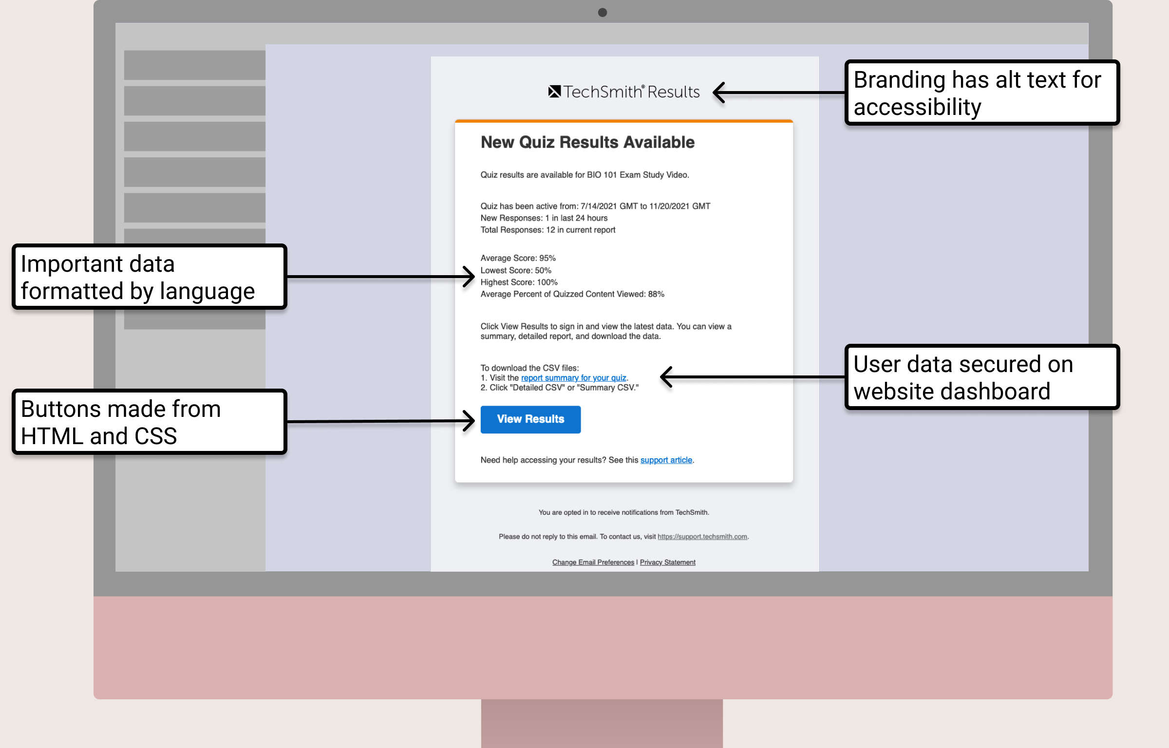
The web has come a long way, but email remains a complex mess of old practices and standards. But that doesn't mean that we can't make the best of the basics. HTML and CSS are powerful, and replacing all the "images as buttons" with proper code, with alt text and responsiveness makes a huge impact on every user.


Look at all this value! Kinda makes you want to check your inbox, huh?

Outcome
Users now get both a more modern looking email and a more functional one. They can view that email across different screen sizes and devices, and they can access the data with their screen reader or keyboard. If their email client blocks images, they can still see the link to view their user’s quiz scores.
This work also built a foundation to implement a single unified system to manage email across all of the company's products and services.
 work
fun